ingoFont DePixel


  • ingoFonts Home
  • the Fonts
    • A—Z
      • Absolut
      • Absolut Fat
      • Absolut Sketch
      • Amhara
      • Analogue
      • Anatole France
      • August Sans
      • Auxerre
      • Banknote 1948
      • BD Lettering
      • Behrens-Schrift
      • Biró Script
      • Bruta Woodcut
      • Charpentier Classicistique
      • Charpentier Renaissance
      • Charpentier Sans
      • Chiq
      • Conté Script
      • Countries of Europe
      • DeBorstel Brush Script
      • DeDisplay
      • DeFonte
      • DéFormé
      • Dékó
      • DeKunst
      • DePixel
      • Diesel Rudolf Script
      • Die überschrift
      • Deutsche Schrift Callwey
      • Écono Sans
      • Faber Fraktur
      • Faber Sans
      • Faber Serif
      • Façade
      • Fixogum
      • Fundstueck
      • Guhly
      • Hero
      • Josef
      • Josefa Rounded
      • Josefov
      • Klex
      • Koch-Schrift
      • Maier’s Neue Nr. 8
      • Maier’s Nr. 21
      • Marleen Script
      • Menschenalphabet
      • Novello
      • Palmona
      • TobyFont
      • Wendelin
    • serif fonts
      • Auxerre
      • Charpentier Classicistique
      • Charpentier Renaissance
      • DéFormé
      • Faber Serif
      • Josefov
      • Maier’s Nr. 21
      • Novello
    • sans serif fonts
      • Absolut
      • Analogue
      • August Sans
      • Charpentier Sans
      • Chiq
      • DeFonte
      • Die überschrift
      • Écono Sans
      • Faber Sans
      • Guhly
      • Josef
      • Josefa Rounded
      • Maier’s Neue Nr. 8
      • Wendelin
    • „handmade“ fonts
      • Absolut Sketch
      • Anatole France
      • BD Lettering
      • Biró Script
      • Bruta Woodcut
      • Conté Script
      • DeBorstel Brush Script
      • Diesel Rudolf Script
      • Deutsche Schrift Callwey
      • Façade
      • Fixogum
      • Hero
      • Klex
      • Maier’s Nr. 8
      • Maier’s Nr. 21
      • Marleen Script
      • Palmona
      • TobyFont
    • decorative fonts
      • Amhara
      • Anatole France
      • Banknote 1948
      • Behrens-Schrift
      • Chiq
      • Countries of Europe
      • DeDisplay
      • DeFonte
      • DéFormé
      • Dékó
      • DeKunst
      • DePixel
      • Façade
      • Fundstueck
      • Guhly
      • Maier’s Nr. 8
      • Maier’s Nr. 21
      • Menschenalphabet
      • TobyFont
    • blackletter fonts
      • Behrens-Schrift
      • Deutsche Schrift Callwey
      • Faber Fraktur
      • Faber Gotic
      • Hero
      • Koch-Schrift
      • Palmona
    • all fonts
    • free fonts
  • Graphics
    • Flags from around the world
    • Maps
    • get in touch
    • legal stuff
  • dedeutsch
    • deutsche Version
    • 1999

      Nothing more than Apple’s renowned system font ”Geneva“ in the bit map representation, but as a PostScript font; aliased like ”Geneva“ in 9 or 10 points, or even in resolutions that are too small, that is, under 8 points; ideal for ”pixely“ topics.

      An anachronism in the digital age: While the whole world speaks of progress, the font on the monitor has only ”progressed“ into a non-pleasant-to-read conglomeration of pixels. Each object on a monitor is displayed by lining up individual pixels. These pixels are so tiny, that they are hardly perceivable. The more pixels per surface unit (that means, the higher the resolution), the more the picture perceived by the eye merges into a sharply defined unit.

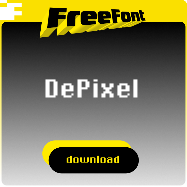
    • DEPIXEL is based on the monitor fonts ”Geneva“ and ”Chicago,“ developed by Apple Computer. It simulates the configuration of individual pixels into letters. Thus, a font emerged which, regardless of size, can be recognized by the composition of a few individual pixels.

    • ILLEGIBLE DEPIXEL came about as a result of exaggerating the pixel effect. As with the other versions, it is composed of individual pixels. But here the cap height only amounts to 5 pixels and the x-height merely 4 pixels. Furthermore, this typeface shows the well-known effect from the Web of a font design which is too small and makes text appear almost illegible. ILLEGIBLE DEPIXEL is not really illegible; its forms were "destroyed" deliberately.

      In comparison, a good legible alphabet must be at least 9 pixels high: 5 pixels for the mean height and 2 pixels each for the extenders. With its proportions, DEPIXEL KLEIN (small) meets these requirements.

      DEPIXEL SCHMAL (thin) stretches out to 6 pixels on the main line whereas the upper and base overhang amount to 2 pixels.

      DEPIXEL BREIT (expanded) was developed by expanding the letters by one pixel. In contrast to the ”normal“ versions, the basis for further versions was Apple’s ”Chicago“ font. By means of doubling the width of the stems, an obviously bolder and larger font was created using the same basic pixel size.

      DEPIXEL BREITFETT (wide and bold) is nothing more than the bold font expanded to double width.

    • Theoretically any font can be ”digitalized.“ This style of reduction to the smallest element of an engineered font charms with its apparent contradiction of the most exact vector drawing technically possible and the primitive construction from ”building blocks.“

    • ingoFont DePixel

      features: none
      character set: Unicode Latin 1 (western und northern European)
      price: free

      •  download


    • type specimen

      DePixel

    •  more decorative fonts

    free font


     more decorative fonts

Questions or comments? Get in touch:


contact
    © 2019 ingoFonts Ingo Zimmermann. All rights reserved.
  • EULA, legal notice