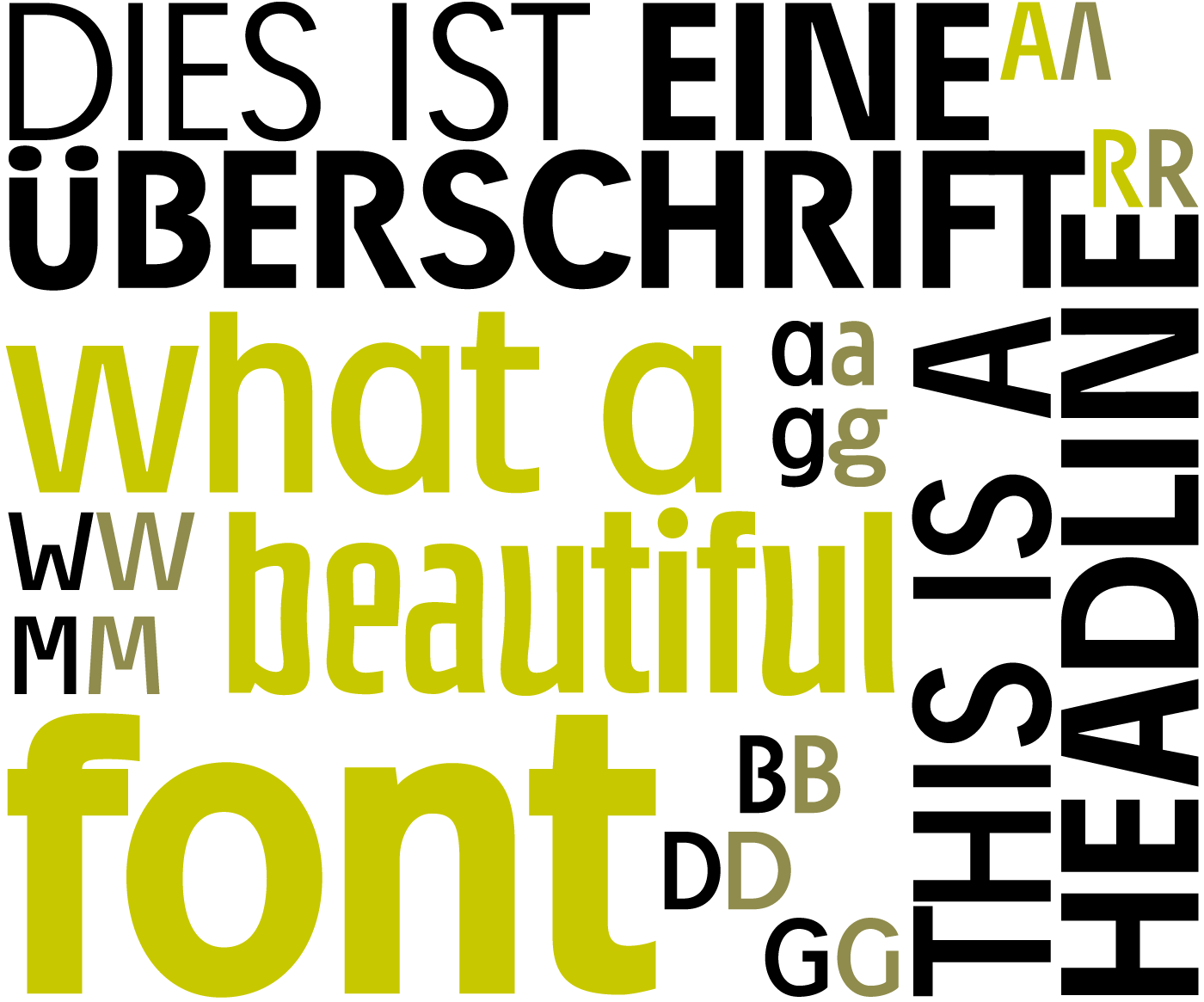
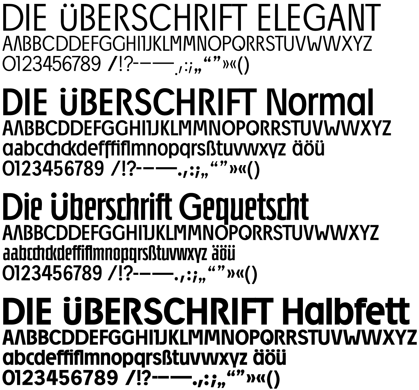
1998 Sans serif headline font; characters are also available in alternative forms
The characters of the DIE üBERSCHRIFT range between the narrow boundaries of cap height and baseline. No ascender or descender breaks through this range. The legibility is ensured particularly by the classic Roman proportions and the greatest possible distinctions in the letterforms.
The uppercase letters of DIE üBERSCHRIFT were originally designed as a headline font for the magazine ”motion“. Their versatility and flexibility, even with deformity and distortion, made them a favorite for ”motion“ layouts. DIE üBERSCHRIFT runs very tight. In order to open up a wider spectrum of utilization for this letter type, minuscules were also conceived with time, adding to the original, exclusively uppercase, typeface

features: none
character set: Unicode Latin 1 (western & northern European)
price: free…more


