
The ballpoint pen woman’s handwriting
As the name suggests — the Iris’ Hand is a woman’s personal
handwriting, written with … more
![]()
Two fonts that just
go together:
Faber Serif | Faber Sans
As the name suggests — the Iris’ Hand is a woman’s personal
handwriting, written with … more

The name suggests it: The Chiq is inspired by a well-known
system font from Apple›s classic Mac OS operating system … more
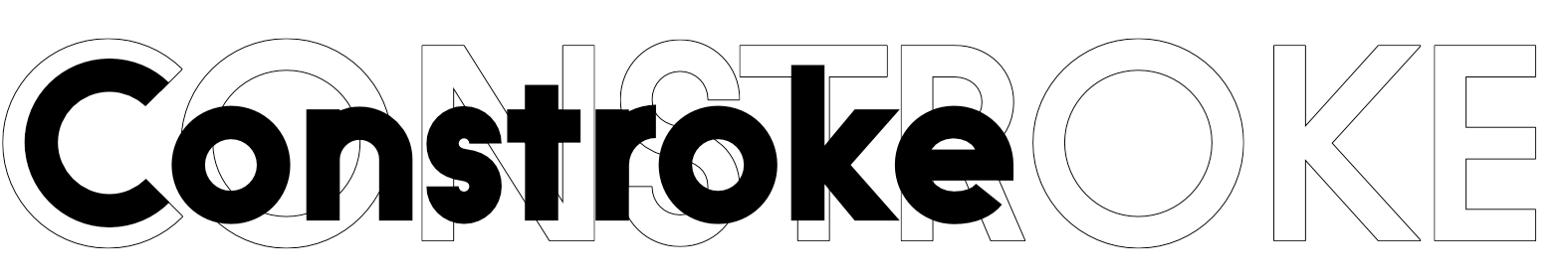
The defining principle of the Constroke: strictly geometrically
constructed character forms with an even stroke width … more
From Hairline to Black — that’s how today’s
students write on the iPad … more

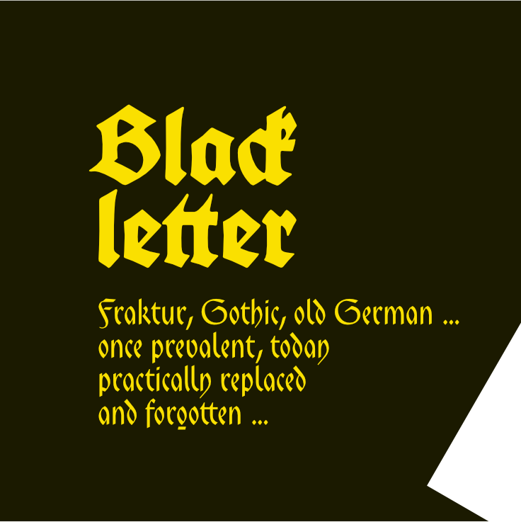
You could also name it «American Gothic», … more
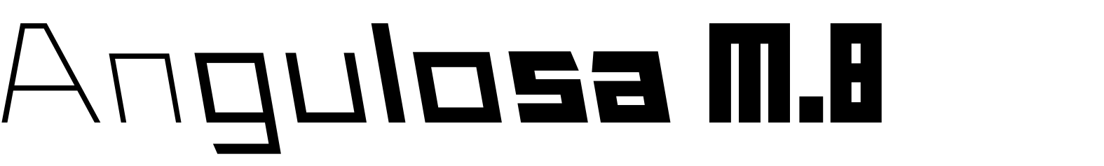
At first glance, Angulosa M.8 is one of those fonts that a technician
or engineer would probably draw. And yet it differs… more
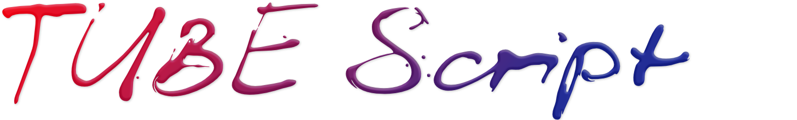
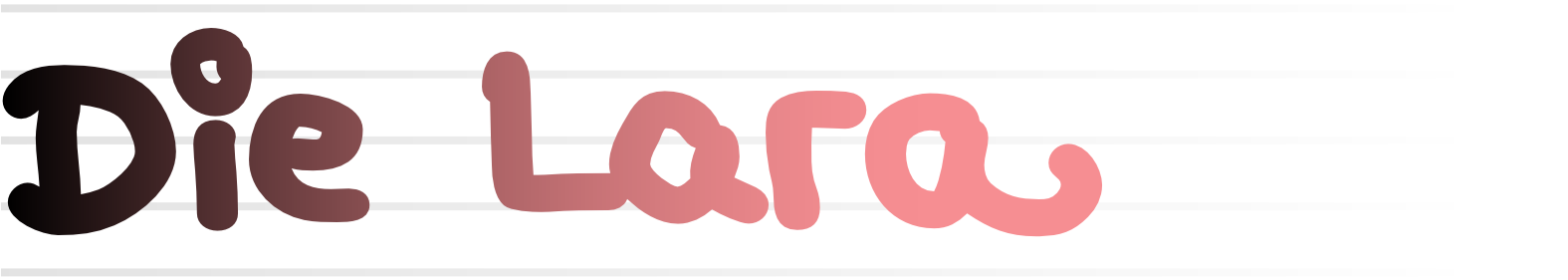
 Tube Script is an individual handwriting
with a slightly wet character. In this case,
the ”pen“ was
a tube of black paint.
It’s easy to see
that you
can’t
really write beautifully with it.
Nevertheless… more
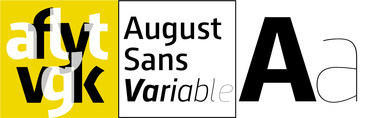
August Sans is a variable font now.
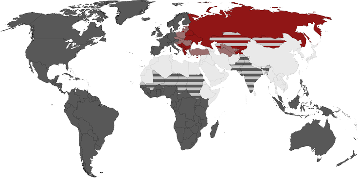
And it supports Eastern European languages,
Greek,
Cyrillic and Vietnamese.
Additional features and lively forms
bring a little more vitality into typography… more

I found the example of the Anatole France in an old script portfolio…
explore more

The Amhara is a latin typeface modelled on the ethiopian Ge’ez script… explore more

The Analogue, a classic style sans serif, is now also available as a variable font. From Hairline to Black plus the corresponding italics - all gathered in a single file. Also new: alternate glyphs, swash letters and arrows… explore more
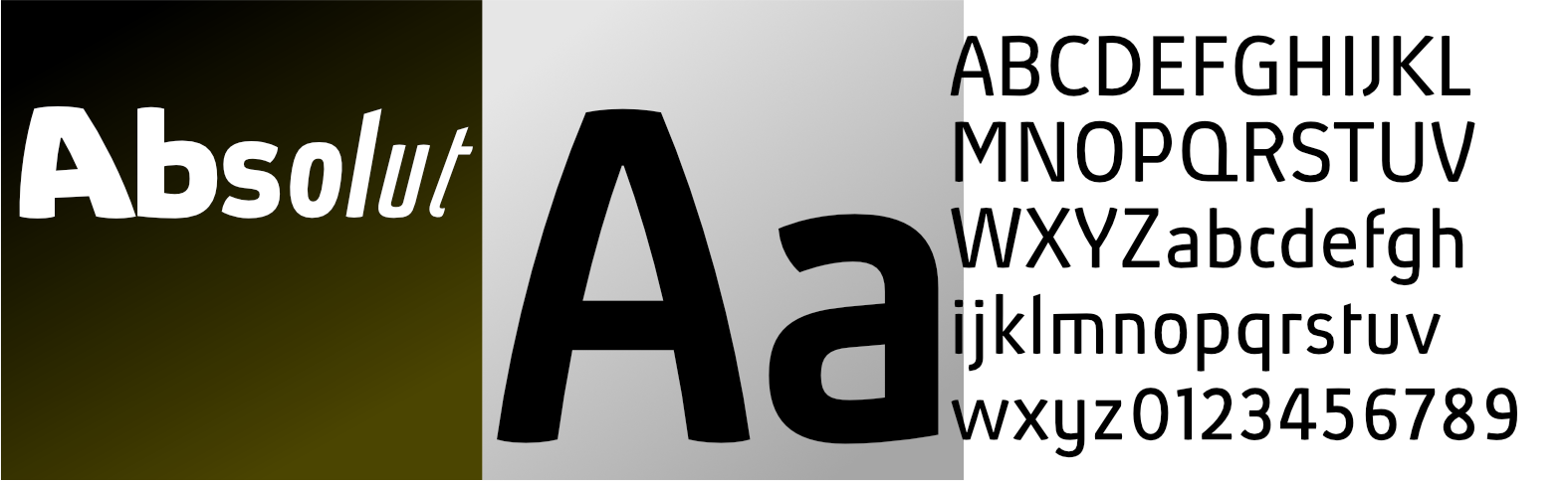
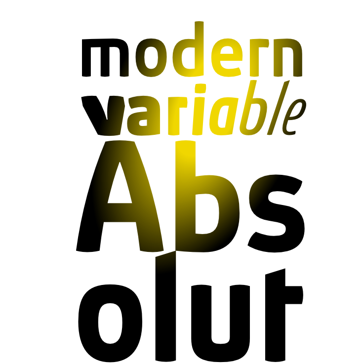
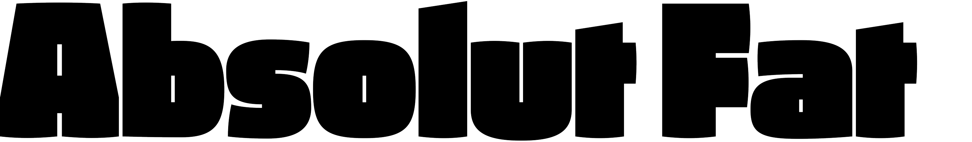
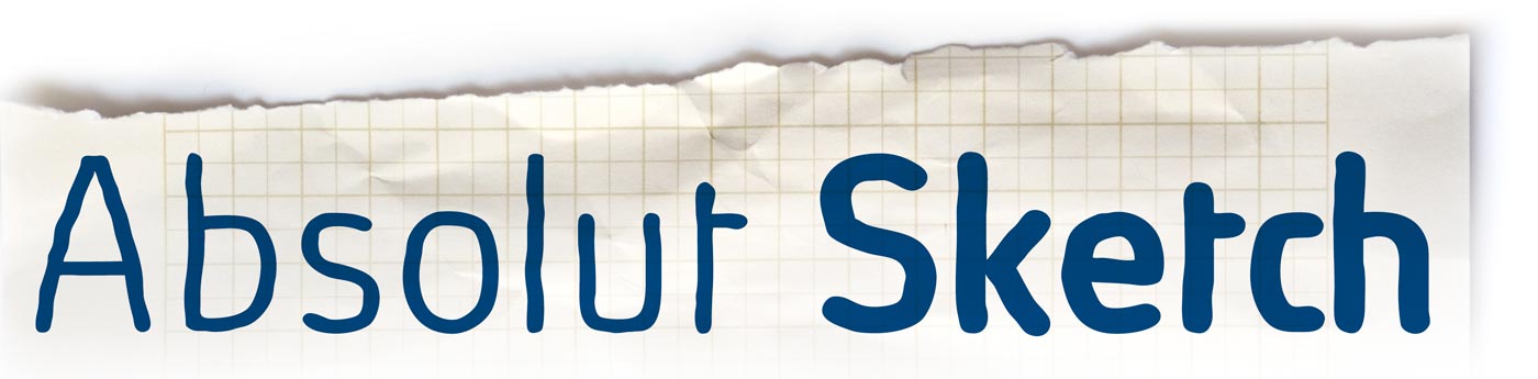
Absolut, the modern sans serif for the 3rd millenium, has been expanded again and is now available as a variable font. The range is from Thin to Black, widths from UltraCondensed to Expanded and italics reaching from Backslanted to ExtraItalic. Not forgetting the handmade Absolut Sketch and the ultrabold Absolut Fat… explore more
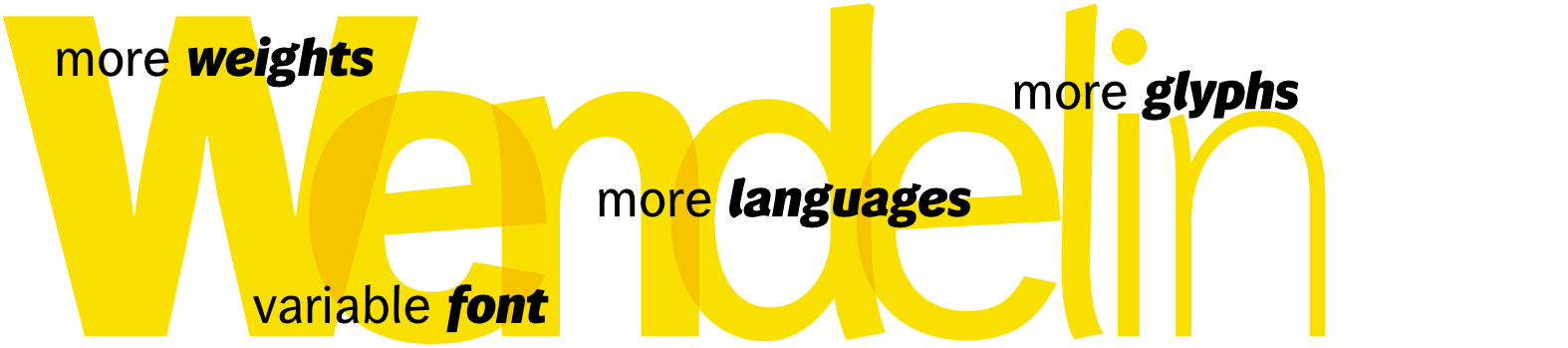
It’s the first variable font by ingoFonts: the Wendelin now covers a wide range of weights – from Thin to ExtraBold. In addition many extras such as small caps, several kinds of numerals, arrows… more
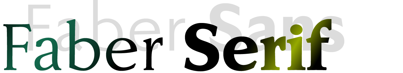
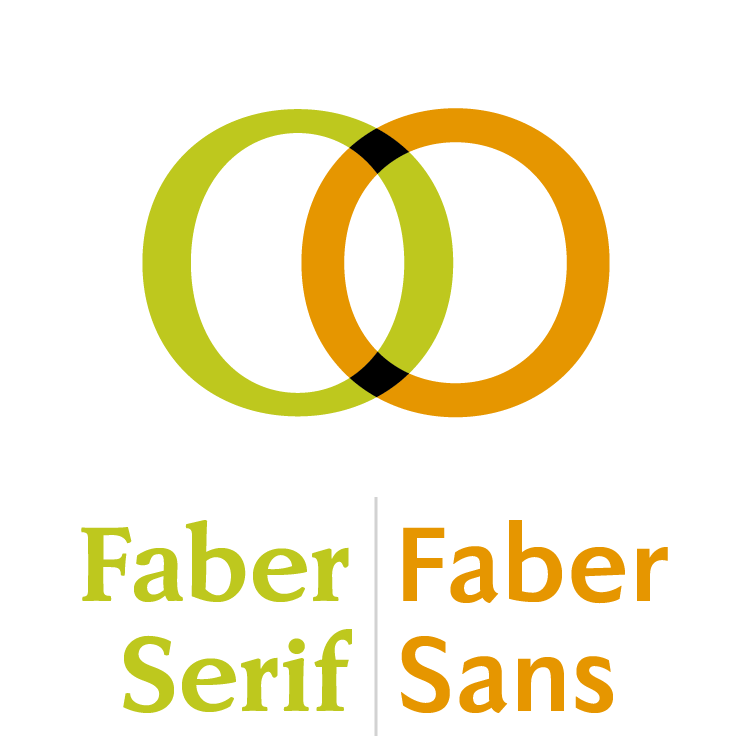
The Faber font family is all new. The Faber Serif now has ten weights with loads of features, including stylistic alternates, small caps and alternative numerals… more
The modern sans serif has been extended.
Now it contains four more weights plus
additional
OpenType features, e.g. small caps… more
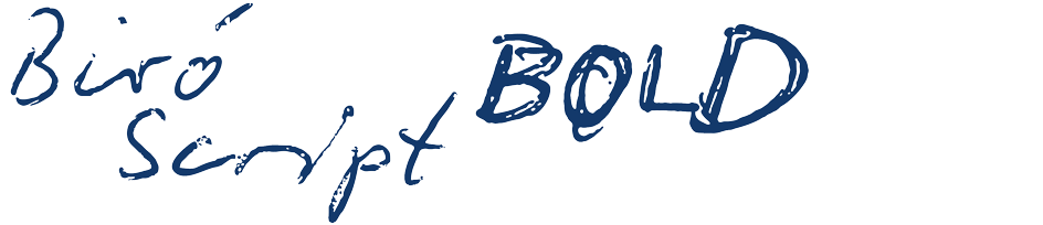
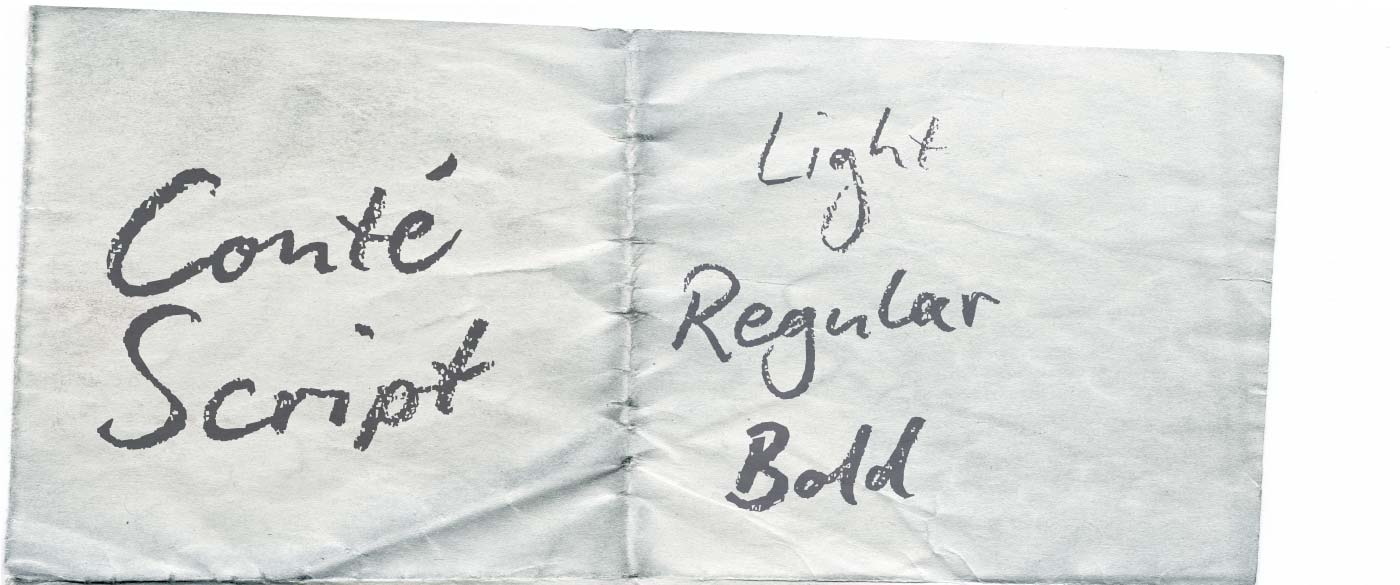
The fascinating ballpoint pen script now got a bold weight in addition to the “regular” and “sloppy”.

Geometrically constructed fonts do not necessarily have to be pointed and angular; It also works consistently around.
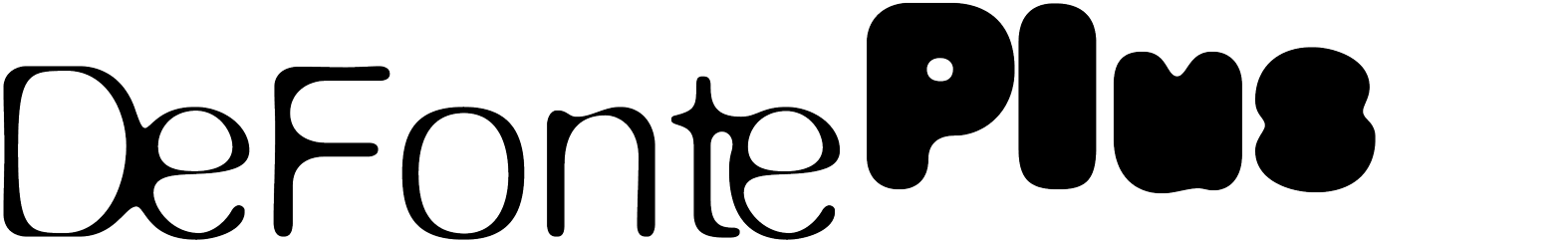
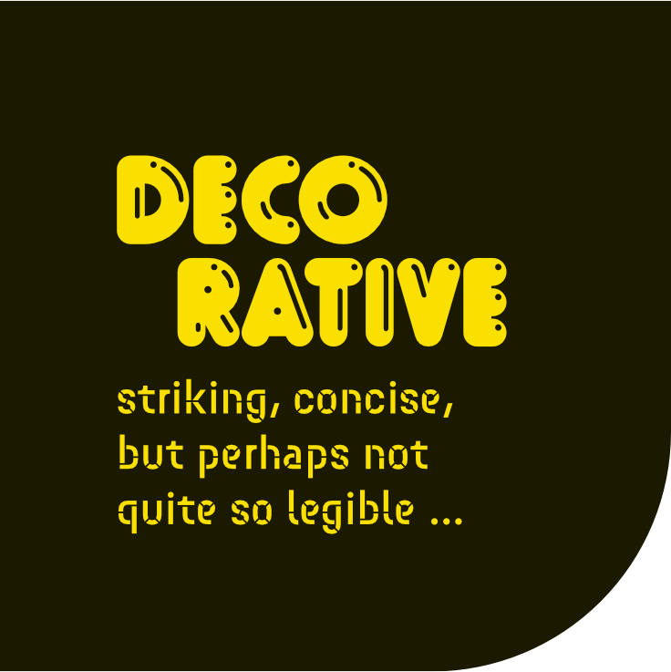
The playful, decorative DeFonte finally is developed for all requirements.
In Belgium and France comics are referred to as ”Bande Desinée“, in short ”Bédé“ or even shorter BD.

A beautiful text typeface whose unostentatious forms… more
Sometimes, it may be more suitable to use a font with a less clean effect instead… more
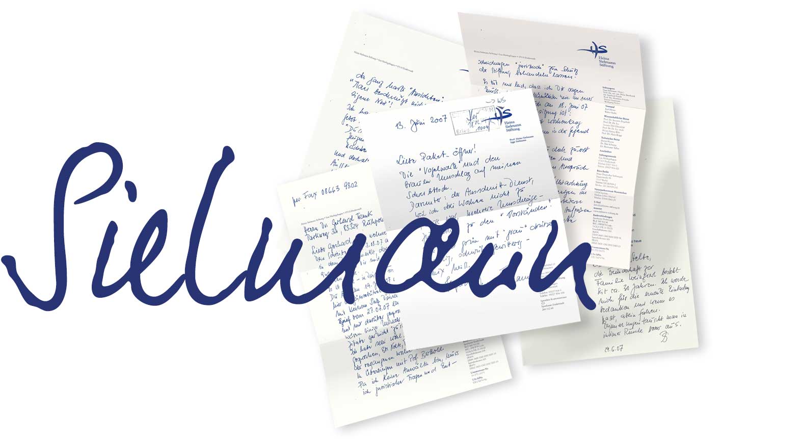
This font has been developed exclusively for SAZ Services and their client Heinz-Sielmann-Stiftung. Coming from a few samples… more
Fonts can be so simple. And for free! more
Buy fonts directly from the maker.
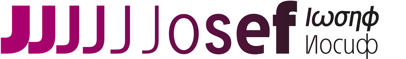
Language support:
Standard (Latin 1),
Plus (+ Latin Extended A)
Pro (+ Greek + Cyrillic)
 All fonts include
OpenType .otf (PostScript) and .ttf (TrueType) + WebKit (web fonts and .css)
Here's the catch: Most files offered here to download contain only a reduced font. That means, the font only consists of uppercase and lowercase from A to Z or rather, a to z. The complete font including numbers, umlauts, punctuations and especially the ligatures is only available with your order and your cash.

If you need more than one license, just ask – we offer quantity discounts.
Get your (almost) daily dose
of ![]() ingoFonts — just scan:
ingoFonts — just scan:

visit ![]() ingoFonts on
ingoFonts on