
With fonts, it’s
always a question of
readability
Well, yes — that depends on the font, of course…
A German saying begins with
‘What you own in black and white…’
So let’s take a look at it
‘in black and white’:
Even at first glance, you can see that…

… that you can’t recognise everything.
But what did we just see there? Always the same sentence, always set in a different typeface.
And in pretty much all ingoFonts, at that.
And how much of it could we read straight away?
Very little, in fact.
With so many different fonts available, only a very small number meet our standards for good legibility straight away.
Isn’t readability a fundamental requirement for any typeface?
Well, yes… Sometimes the typeface itself is meant to convey something. In that case, form and style come to the fore. And when appearance becomes the focus, other characteristics can easily be sidelined. ‘Handwritten fonts’ and ‘display fonts’ simply cannot compete when it comes to legibility.
It depends on the purpose a text is intended to serve. After all, it makes a difference what the text is about. Whether a longer, possibly complex text can be read attentively and at ease, or whether a short but perhaps important piece of information needs to be conveyed unambiguously, as on warning signs and wayfinding systems.
So let’s stick with the former case.
- - - - - - - - - - - - - - - -
The most common example of a long text is the classic book, but in the case of contracts, user manuals, news articles and many other types of text, good readability makes engaging with the text much easier.
Like so many things, legibility is a highly subjective matter. Just how individual our perceptions as readers are is evident from the fact that I consider my own handwriting to be perfectly legible, whilst everyone else’s is… well…
And the same applies to typefaces: over the course of our lives as readers, we have simply become accustomed to certain typefaces. It no longer matters at all whether they are good typefaces or not.


For some time now, we have been witnessing a change in reading habits.
The very fact that we are discussing typefaces here on a screen perhaps illustrates the most significant shift away from reading on paper and towards digital media.
On paper, we would certainly have a different perspective on the typeface in question.
Our assessment would then probably be different.
In our supposedly highly developed culture, people don’t read as much as they used to (nor do they write much themselves [and not just since the advent of AI] – but that’s a topic for another time).
As a result, people’s ability to grasp texts quickly and fluently is also dwindling. Often, texts are merely spelled out and deciphered.
Of course, it is also the responsibility of graphic designers to ensure that a text is presented in a reader-friendly way or not.
In the Anglo-Saxon language area, it is not unusual to set entire passages of text in capital letters (nowadays even in handwriting), elsewhere this is regarded as obstructing reading, and is therefore often used in ‘small print’ – text you have to accept, but which is not actually meant to be understood.
Avid readers find it, at the very least, inappropriate to have to read a book in a typeface other than a humanist font. Conversely, for inexperienced readers, an old-style font is unfamiliar and more difficult to read than a sans-serif font. And that is why there are now new styles of Antiqua fonts with very subtle serifs, and sans-serif fonts that borrow the contrast between the main stroke and the hairline stroke from the Antiqua style.
For a very long time, it was precisely the Roman typeface that was regarded as the most legible, thanks to its serifs—which facilitate the flow of reading—and the varying stroke thickness that evokes handwriting. But this presupposes a certain ‘reading culture’—and it seems we can no longer assume, or are no longer willing to assume, such a culture exists today.
The style of our standard typefaces kept changing over time to adapt to cultural and technical circumstances.
Johannes Gutenberg, who was, after all, the first to put this into practice, wanted to print in a style that resembled handwriting.
Shortly afterwards, during the Renaissance, the first efforts were made to improve legibility.
As new developments emerged, an ever-increasing variety of typefaces came into being, such as advertising typefaces and newspaper typefaces in the 19th century.
Changing trends also play a role, both in the design of typefaces and among users and readers.
Yet the printed word has become less common in our lives anyway. However, typeface as a means of communication is by no means obsolete—quite the contrary.


This selection of ingoFonts clearly demonstrates that some typefaces are visibly more pleasing and easier to read than others.
This can be assessed on the basis of a few key characteristics, amongst other things:
-
the contrast between the main stroke and the thin strokes;
-
the refinement of the letterforms and their distinctiveness;
-
the proportions of the letters;
-
the x-height;
-
the ‘word image’;
-
the overall impression of the typesetting.
- - - - - - - - - - - - - - - -
We still perceive information most effectively in written form, though less and less often in longer contexts, and also less frequently on paper.
But the idea of what defines a legible typeface has changed time and again. At one time, the strict, high-contrast design of the classical period was regarded as the ideal; others still regard the old Renaissance antiqua typefaces as the one and only truly suitable reading typefaces; whilst others advocate sans-serif typefaces that are as simple as possible, without the frills.
As things stand today, it is the latter – the sans-serif typefaces – that have prevailed.
In schools today, reading (and writing too) is taught using truly ugly, simplistic ‘school typefaces’. This unfortunately leaves a lifelong impression.
The ubiquity of Helvetica and its derivatives should therefore come as no surprise to anyone. Well, it’s not called the ‘font without characteristics’ for nothing; there are certainly better ones out there, particularly in terms of legibility. And I don’t just mean as alternatives, but objectively better fonts (specifically in the plural).
- - - - - - - - - - - - - - - -
Type designers, convinced that there must be a best-possible typeface for every purpose, devote a great deal of time and effort to developing new typefaces. Recently, these have mainly been fonts designed specifically for on-screen display, simply because it has become clear that none of the conventional typefaces are really suitable for reading on the screens and displays of a wide variety of devices.


In any medium, for the quick comprehension of textual information, it is important that the letters are perceived as clearly distinguishable, without losing the connection to the next letter.
The Latin alphabet – like the Greek and Cyrillic alphabets – makes a distinction between upper-case and lower-case letters. Some of the lower-case letters have characteristic features, such as an ascender extending above the x-height or a descender extending below the baseline. One small peculiarity is the lowercase ‘t’, whose top is shorter than an ascender. And in many typefaces, the ‘g’ has an unusual yet characteristic loop as a descender.
This creates distinctive word images that the eye often recognises without having to identify the individual letters. However, this will only work well if the typeface designer balances the ascenders and descenders appropriately. This is often overlooked, particularly in typefaces of American origin, especially sans-serif ones.
- - - - - - - - - - - - - - - -
The detailed design of each individual character is of paramount importance.
The letters of an alphabet are essentially always constructed from the same recurring formal components. The shape of the lower-case o, for example, is found in the letters b, d, p and q; the same applies to other components. This gives rise to the overall character of a font.


Pursuing a design concept too rigorously can quickly lead to letterforms that are similar and therefore easily confused. Ensuring that letters remain clearly distinguishable is an essential feature of highly legible typefaces. This also means that every letter and every character has its own unique proportions.
The flow of reading, in turn, is influenced by the stroke; this is why some fonts feature a ‘tail’ at the end of certain letters, which guides the eye to the next letter. In Antiqua typefaces, the serifs fulfil this function. The interaction of the letter spacing with this results in word images that are perceived, to a greater or lesser extent, as belonging together. If a typeface is so well designed that one can easily grasp the word images without having to decipher individual letters, then the eye no longer stumbles letter by letter through the line. Instead, we jump from one point of focus to the next, taking in the passages in between as well. Ideally, this enables ‘skimming’. It is only when encountering unfamiliar terms that one pauses to ‘spell them out’.
- - - - - - - - - - - - - - - -
Readability also plays a role in other contexts – sometimes even a crucial one. This refers to the broad field of information systems. Whether it is a serious warning or the ubiquitous signposts, type must function even under the most unfavourable conditions imaginable: under stress, in a rush, in poor light, when glancing briefly whilst driving past at speed… Even in mundane advertising, the message should be conveyed as quickly, directly and immediately as possible. In other words, whenever the ‘sender’ of a piece of information wants it to be grasped quickly, unhindered and without distraction by the ‘receiver’.
In most cases, these contexts involve short, memorable messages. Just a single word, or at most one or two sentences: CAUTION DANGER, exit in 500 m, ‘Probably the best product in the world’. To achieve this, you need anything that attracts attention in any way; apart from the typeface, this includes high-visibility colours, striking shapes, lighting, etc.
Anything that serves this purpose is suitable. An easily legible typeface is always helpful in such cases. It is no longer a question of pleasant, fatigue-free reading as with a book; rather, what is required is clear and, above all, rapid comprehension. For this kind of emphasis, even ‘reading typefaces’ include additional bolder variants within their font family.
When it comes to choosing a typeface, this can also be a font that immediately catches our attention. But display typefaces are a topic in their own right.…
… for example
Lecturia
A modern humanist sans serif typeface


It’s lively forms bring some motion into sans serif. Ascending dynamic movement characterizes the structure of it’s characters — stylistic alternates emphasize this impression.
The family comprises eight weights from the most delicate "Hairline" to the strong "Bold" — each upright and italic. Using the variable font, the intermediate levels can be controlled fluently.
The forms and proportions of Lecturia have been selected to be very legible as body type for longer texts. It is still legible from a great distance or under unfavorable conditions. In large sizes as a heading, the font is very eye-catching.
The shapes of the individual characters follow the "humanistic" form language of modern faces. This makes Lecturia an attractive alternative to most of the sans serif fonts used today.
In addition to ligatures for problematic letter combinations, it contains stylistic alternates for some characters that make the appearance even livelier.
Small caps provide a restrained opportunity for emphasis.
In addition, Lecturia offers several sets of numerals:
-
proportional standard figures
-
lining figures
-
proportional oldstyle figures
-
non-proportional tabular figures
-
superscripts and subscripts
-
numerator and denominator to represent fractions
-
numbers in a circle
The very good legibility of Lecturia makes it the ideal typeface for information systems — a selection of directional arrows is included.
… for example
Analogue
A traditional sans serif


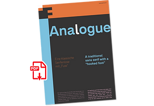

The Analogue is a traditional sans serif — functional but friendly, and very classic.
-
very traditional forms
-
strongly slanted italic
-
consistant proportions
-
extraordinary ligatures
-
swashes
-
alternate letters
-
alternate figures
-
lower case l with a hooked “foot”
Believe it or not, there are hardly any sans serif fonts in which the lower case letter l also has the hooked form of an l. Instead, we readers have to constantly distinguish whether we are seeing an uppercase I or a lower case l — just take a look at the word “Illinois”…
The Analogue was developed for exactly this reason. The intent: To create a pretty much »ordinary«, even classical font with its most striking characteristic being the inclusion of the “crooked l.”
As a model, I used the »mother of all sans serifs«, Akzidenz Grotesk from Berthold, with its beginnings going back to the 19th century. Analogue is so to say a new interpretation of Akzidenz Grotesk from ingoFonts. All characters — following the model — have been newly designed. And if you want to emphasize the shape of the hooked foot even more, you can also activate the alternate styles for d, h, m, n (Style Set 1).
Conversely, the alternate a somewhat softens the “hooked” impression (Style Set 2).
The slanted versions — it isn’t truly a real cursive font — are noticeably stronger with 13° than the italics in comparable fonts, and were given a round e with a mind of its own which distinguishes itself considerably compared to the upright characters in the overall appearance of the font.
More modern and formal solutions in detail were chosen for some of the characters, for example the M was given lightly slanted sides; the a reflects the curves of the s; the “feet” of a, l and t match; the flared legs of K and R became a “foot”, too.
General proportions were carried over almost completely with no changes from Akzidenz Grotesk as well as the slanted trimming on the open forms of a, c, e, s; in comparison, C, G and S were given straight endings.
Analogue contains many ligatures, even discretional ligatures, plus proportional, old style as well as tabular figures.
All in all, at first sight Analogue brings back memories of the charm of its well-known predecessor; and yet, many small differences give Analogue an unmistakable certain something...
… for example
Charpentier Renaissance
A very legible Venetian Roman typeface


This typeface is based on the desire to create a Venetian typeface like those which might have existed at the beginning of the »printing age« — the basic form oriented on the classical Roman and early Middle Ages models, the ductus defined completely by writing with a wide pen and much individual expression in detail.
In the spring of 2005 I had the opportunity to closely examine a few pages in the famous book »Hypnerotomachia Poliphili« from 1499. The script used here from Aldus Manutius is exemplary. Most of the book, however, is not very carefully printed. The characters do not stay on the line; the print is at times too strong and at times much too weak.
And on these imperfect pages the true character of the letters is recognizable; that is, that they are cut with lively detail which is a result of the patterns provided by full-time writers. After all, around 1499 script was written as a rule and the printed type was oriented on this pattern.
I prefer the typeface on the lightly printed pages. The characters are not placed neatly on the line, but the distinct and emerging lively ductus of the individual characters automatically presents harmonious word formations in the eye of the beholder, with the non-perfect line stepping into the background.
Also in Charpentier Renaissance, the strokes of the wide pen are still noticeable. The font has very defined softly bent serifs. The forms are powerful and stand solidly on the baseline.
Charpentier Renaissance is very legible and yields a solid and yet still lively typesetting.
The accompanying italic, like its historical models, has almost no inclination. The lower case characters of Charpentier Renaissance Italique have such idiosyncratic figures that they can also form a font of their own.
… for example
Charpentier Sans
A humanistic sans serif


The proportions of Charpentier Sans are directly derived from Roman capitals and the humanistic book-face. The contrast between strokes and thin strokes is based on medieval uncial script. And thus, a modern sans serif was created emphasizing thick and thin strokes together.
The first version of this font was created in 1994 within the framework of the bid placed by the city of Graz to become the location for the Winter Olympics in 2006. Appropriately, its original name was ”Olympia.“
The font is intended to embody classic ideals as well as to meet modern demands.
Thanks to its traditional form language, Charpentier Sans is very legible, adapts to various forms of content and expresses a kind of calmness and certainty. Details resulting from writing with the quill guarantee that the font doesn’t appear too rough and unemotional.
Even the tiny, pointed mini serifs contribute to the unmistakable appearance of the font. They create an exciting contrast to the soft flowing forms of the letters and are, to a great extent, conducive to the legibility. Consequently Charpentier Sans always appears with an extremely sharp and clear outline.
Charpentier Sans Italique has an even more distinct ductus derived from writing. Especially the rounded forms from a, e, f, g and y reflect the handwritten humanistic cursive.
Charpentier Sans is comprised of many ligatures, including unusual ones, plus proportional medieval and capital figures for the normal type as well as disproportional tabular figures with a consistent width.
Above and beyond the ”normal“ Latin typeface system, small caps are available as an especially elegant form of distinction.
… for example
Charpentier Classicistique
A classicistic Roman typeface


This Roman typeface has a livelier effect than is typical of the epoch of classicistic style.
In the lower case letters, an echo of the smoother forms of historically early scripts is identifiable. Typical of a classicistic Roman typeface are the emphasized and clear contrast in the weight of the strokes, the fine serifs and the accentuation of the vertical bold stem. Charpentier Classicistique is pleasantly legible. Its effect is much less harsh than other classicistic fonts. The pointed forms of M and N are uncommon.
At 30°, the italic version of Charpentier Classicistique Italique is unusually strongly slanted. The italic lower case letters refer, in part, to English handwriting, which also falls under classicism. Especially the curves show forms influenced by writing.
Charpentier Classicistique is available in four font weights:
regular, semibold, bold and black.
Thanks to OpenType and Unicode, Charpentier Classicistique includes lots of ligatures, also discretional ones, as well as figures for normal setting and tabular figures with constant width and cap-height figures.
… for example
Desphalia
A classic “American” sans serif with a kink


Desphalia belongs to the kind of sans serif fonts that were created in the 19th century. You could also name it “American Gothic”, a sans serif in the style of fonts like Franklin Gothic, News Gothic and similar. Above all, the high x-height characterizes this typeface style, as do the identical heights of uppercase and ascenders.
However, I allowed myself a few peculiarities ;-)
On the one hand, there is the gently sloping horizontal middle line on letters such as H, E, F, A and e. The M also got gently slanted sides. Some of the lower-case letters have an up- or down-stroke: a d m n p u. This "kink" on the shaft also serves to better distinguish the small l from the capital I — as can be seen clearly with the term »Illinois«.
In keeping with the tradition of American typefaces, Desphalia does not have a true italic. Rather, the letters of the “Italic” have the same character forms as the normal upright variant, but in oblique — and so it is not called “Italic” but “Oblique”.
Style Set 01
Another American peculiarity is the capital I with dashes above and below. It is included in the Desphalia as an alternate character form. An alternative small l with the “kink” in the ascender is also included — as is a y with the “kink” in the descender.
Style Set 02
The corresponding “straight” forms a d l m n p u without the break are included as alternatives in a separate style set.
Small caps
Small caps are uppercase letters that are optically the same size as lowercase letters. They offer a very classy way of emphasis.
Desphalia is available in the widths Condensed, Normal and Expanded, the weights include Thin, Light, Book, Bold, Black.
Using the variable font, all intermediate levels can be freely selected.
The figures are optionally available as tabular figures, proportional lining figures or old style figures.
… for example
Faber Serif
The restrained Roman typeface


Faber Serif is the Roman typeface which was born out of the sans serif design Faber Sans. The proportions are nearly identical to those of Faber Sans.
In comparison, Faber Serif has heavy — although very short — serifs. The character of contrasting strokes is not very pronounced; therefore, this font is closely related to the first Roman typefaces from the 15th century. The Kursiv (Italic) also has very reserved serifs, which are quite appealing to modern reading habits.

… for example
Faber Sans
The classic-modern Sans Serif


Two fonts in one: stylistic alternates give the font a completely different ”look.“
Faber Sans is a sans serif in the style of the classic modern typefaces of the early 20th century — Paul Renner's Futura and Gill Sans were the inspiration.
The result is a font with pleasantly rhythmic proportions that is extremely pleasant to read, especially in large amounts of text, but it is also easy to read under the typographically adverse conditions of the screen.
Several OpenType features are included in the font, which can be switched on and off as required:
-
Stylistic alternates: replaces the letters a, f, g, l, r in each case with the alternative variant, also in the ligatures.
-
Ligatures: replaces the letter sequences fi, fl, ff, ffi, ffl, ft, tt, Th with the respective letter combination.
-
Discretional ligatures: replaces the letter pairs ch, ck, mmwith the respective letter compound and SS with capital ß.
-
Tabular numbers: replaces the normal figures with tabular figures with identical character width.
-
Oldstyle numbers: replaces the normal figures with figures that have ascenders and descenders like the lowercase letters.
-
Fractions: replaces the character combinations 1/2, 1/3, 1/4 etc. with the corresponding fractions.
-
Slashed zero: replaces the normal “open” 0 with the version with a slash.
-
Small caps: replaces lowercase letters with uppercase letters at the optical height of the minuscules.
-
Historical letter forms: replaces s with “long s”.
-
Style set 1: replaces the normal figures from 1 to 20 with numbers in a circle.
-
Style set 2: replaces the normal figures from 1 to 20 with negative numbers in a circle.
-
Style set 3: replaces the “two-story” form of a with the “round” variant.
-
Style set 4: replaces the “two-story” form of g with the “round” variant.
-
Style set 5: replaces the “steep” shape of f with the more “sweeping” variant.
-
Style set 6: replaces the “straight” shape of l with the “with foot” variant.
-
Style set 7: replaces the “normal” form of r with the more playful variant with a period.
-
Style set 8: replaces the u with a downstroke with the symmetrical round form.
… for example
Petermann
A friendly modelled sans serif with open oval shapes


Petermann includes weights from hairline to extra black, widths from condensed to expanded, and true italics.
The font family of Petermann is a modern sans serif with certain characteristics.
The shapes, the basic structure of the letters, are designed very functionally. The stroke weight varies very little, there is almost no contrast between hairlines and main strokes.
The round letters emphasize the open oval, their round counters give rhythm to the typeface and make it appear soft and pleasing.
The one-storey round design of the two small letters a and g being especially contributive here.
An identifying feature of Petermann is the set back foot of the lowercase c and e.
Another characteristic is the slanted strokes, the end of which is rounded towards the inside of the letter.
Dots are round in Petermann. This also gives the font a certain sense of softness.
In contrast to classic sans serifs, some letters in Petermann have slight echoes of serifs, which enhance the reading flow. The most striking are the “feet” of the lowercase letters a d l u. They almost look like particularly short and very bold serifs.
But the upper strokes of m n r are also noticeably slightly convex.
Petermann offers numerous OpenType features and style sets. For example, small caps, fractions, circled numerals and the historic long s are included.
There are alternative designs for some letters to give the typeface a completely different overall impression.
Conventional two-story variants of lowercase a and g are available (Style Set 04). You can choose the letters d j l u without “feet” or with a straight stroke (Style Set 01), the lowercase f and the german double s with a descender (Style Set 03).
Variants of some capital letters can also be selected: the M with straight sides, the I with a serif-like upper stroke, the two-story capital W.
Some letters are also available in a more open, lighter design: A B D G P R and, correspondingly, the lowercase e.
Several ligatures also enrich the possibilities of Petermann.
Petermann even includes small caps, i.e. small capital letters matching the height of the lowercase letters.
The numerals are available alternatively as old-style figures, tabular figures or proportional figures. An alternative slashed zero is also included. Fractions and circled numbers (positive and negative) are also part of the character set.


