

… for example
DeFonte
A variation of “Helvetica
according to
the blur principle“


The underlying typeface is based on ”Helvetica“, the only true ”run-of-the-mill“ typeface of the twentieth century. The distorted principle used simulates the photographic effect of halation and/or overexposure.
The light typestyle, DeFonte Léger, nearly breaks on the thin points, whereas on those points where the lines meet or cross, dark spots remain. The characters are ”nibbled at“ from the inner and outer brightness.
On the normal and semibold typestyles, DeFonte Normale and DeFonte DemiGras, the effect is limited almost exclusively to the end strokes and corners, which appears to be strongly rounded off.
The bold version DeFonte Gros is especially attractive. As a result of ”overexposure“, counters (internal spaces) are closed in, while characters become blurred and turn into spots; new characteristic forms are created which are astoundingly legible.

… for example
DéFormé
Somewhere
between Old West
and typewriter


DéFormé was born out of the distortion of the time-honored ”Clarendon“ letterforms, in which the stems and thin strokes have been reversed.
Thus, a typeface was created which will remind some readers of a Western typeface, and others of the ordinary typeface of a typewriter.
Actually, it is still a robust Clarendon, which has survived ists disfigurement quite well. DéFormé, like its ”mother“, is easily legible, in spite of the inherent emphasis which one is not used to seeing.
This is how the original aim of creating an everyday typeface that mitigates all (not just technical) shortcomings proves its worth. Like its original, DéFormé is highly legible, despite the emphasis applied in a way that goes against all visual conventions. It produces very distinctive word forms. Presumably because it is based on a classic typeface, it has survived the trend for ‘distorted’ and ‘deconstructivist’ typefaces unscathed.

… for example
DePixel
Perfect for ‘pixelated’ subjects


While the whole world speaks of progress, the font on the monitor has only ”progressed“ into a non-pleasant-to-read conglomeration of pixels.
DePixel is based on the monitor fonts ”Geneva“ and ”Chicago,“ developed by Apple Computer.
The DePixel Illegible exaggerates the pixel effect. It, too, is made up of individual pixels, but not enough of them. Added to this is the ‘lost pixels’ effect, familiar from the early days of the internet.
However, the DePixel Illegible isn’t actually illegible. Its shapes have simply been deliberately distorted.
In comparison, a good legible alphabet must be at least 9 pixels high: 5 pixels for the mean height and 2 pixels each for the extenders. With its proportions, DePixel Klein (small) meets these requirements.
Theoretically any font can be ”digitalized.“ This style of reduction to the smallest element of an engineered font charms with its apparent contradiction of the most exact vector drawing technically possible and the primitive construction from ”building blocks.“

… for example
DeKunst
A deconstructivist play on the
positive/negative effects


New forms foreign to letters overlap the familiar contours. Nearly similar forms and reflections lend an ornamental effect to some of the characters. Geometrical gimmicks sometimes call to mind Kurt Schwitters, and incidental amorphous forms make one think of Hans Arp.
And yet, each letter retains the essence for its legibility. Similarly, the illuminators of the Middle Ages also designed their handwritten decorative initials with imagination
DeKunst is truly a child of the PostScript era. Ever since scripts have no longer been designed with brushes and quills, it has become normal, due to technical conditions, to define with vectors.Typefaces are defined by the contours descriptive of the inner and outer form of the letter and their filled in sections. DeKunst was created by distorting and overlapping these lines and surfaces.

… for example
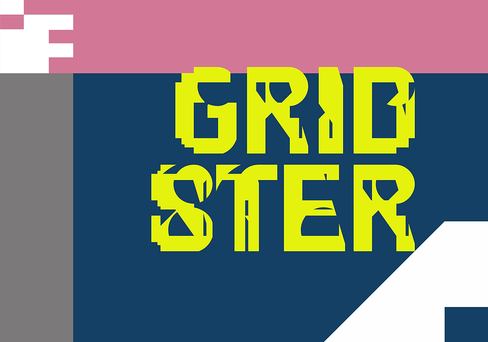
GRIDSTER
letters constructed
in a deconstructivist
style


Deconstructivism, too, operates according to rules. They’re just different. Accordingly, a design grid does not have to be based on a uniform pattern; it can also be structured according to entirely different principles.
Letters are constructed according to a few very simple design principles: they essentially consist of circles, triangles, and rectangles as shape-defining elements. However, letters can also be represented within a grid. We’re all familiar with the various display systems in public transportation; stencil fonts are also constructed according to recognizable patterns, and the best-known examples are probably the pixel fonts from the early days of computing, which are built quite simply from small squares.
But you can also implement this in a completely different way. Not so regular, not so rigidly following just a single, simple repetition principle. How about a few slanted lines? Or varying spacing
GRIDSTER is based on a grid that resembles a geometric carpet pattern more than a design grid. It still looks reasonably orderly, but it leads to unconventional shapes when you try to form something supposedly fixed, like Latin letters, from it.
So if it doesn’t absolutely have to be legible… why not…?