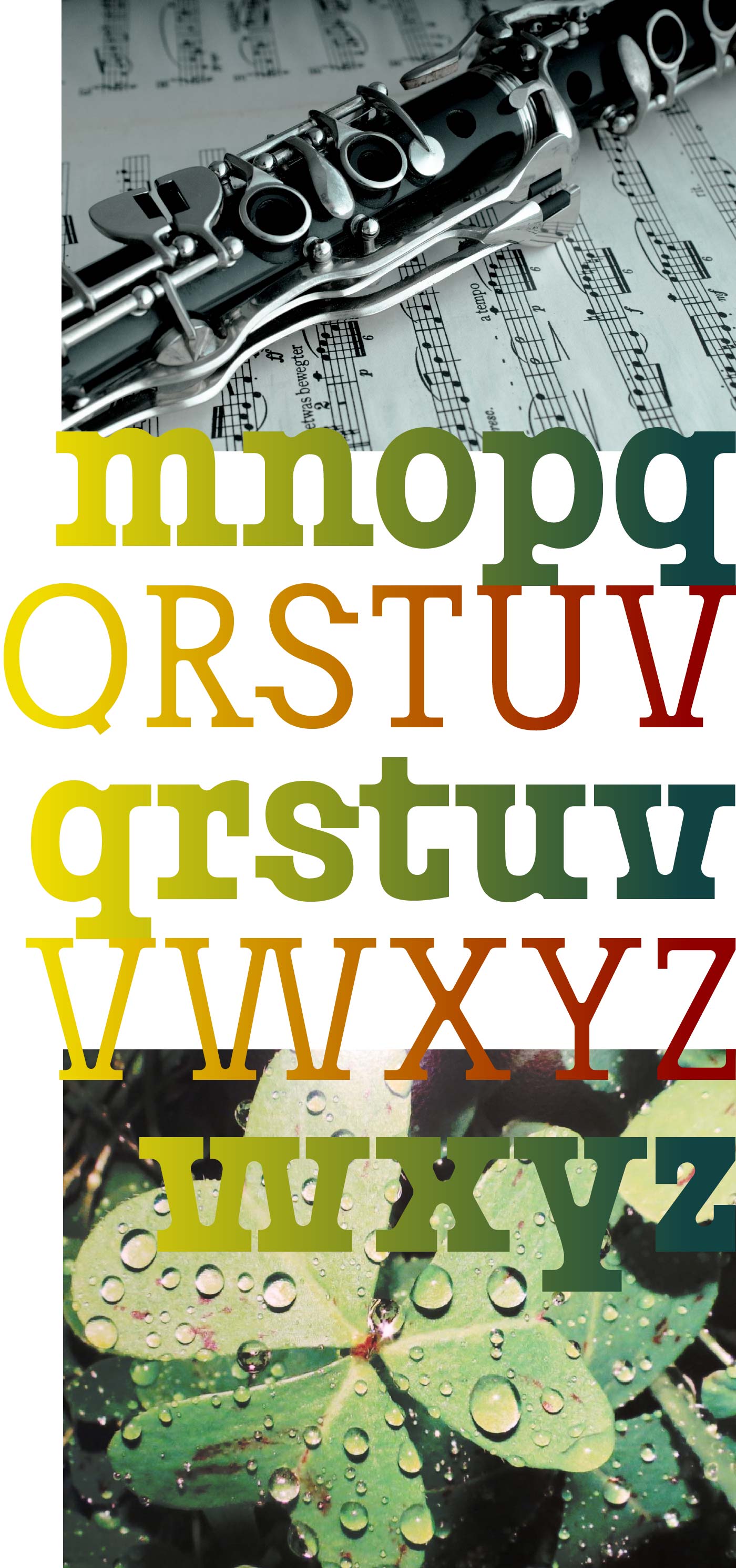
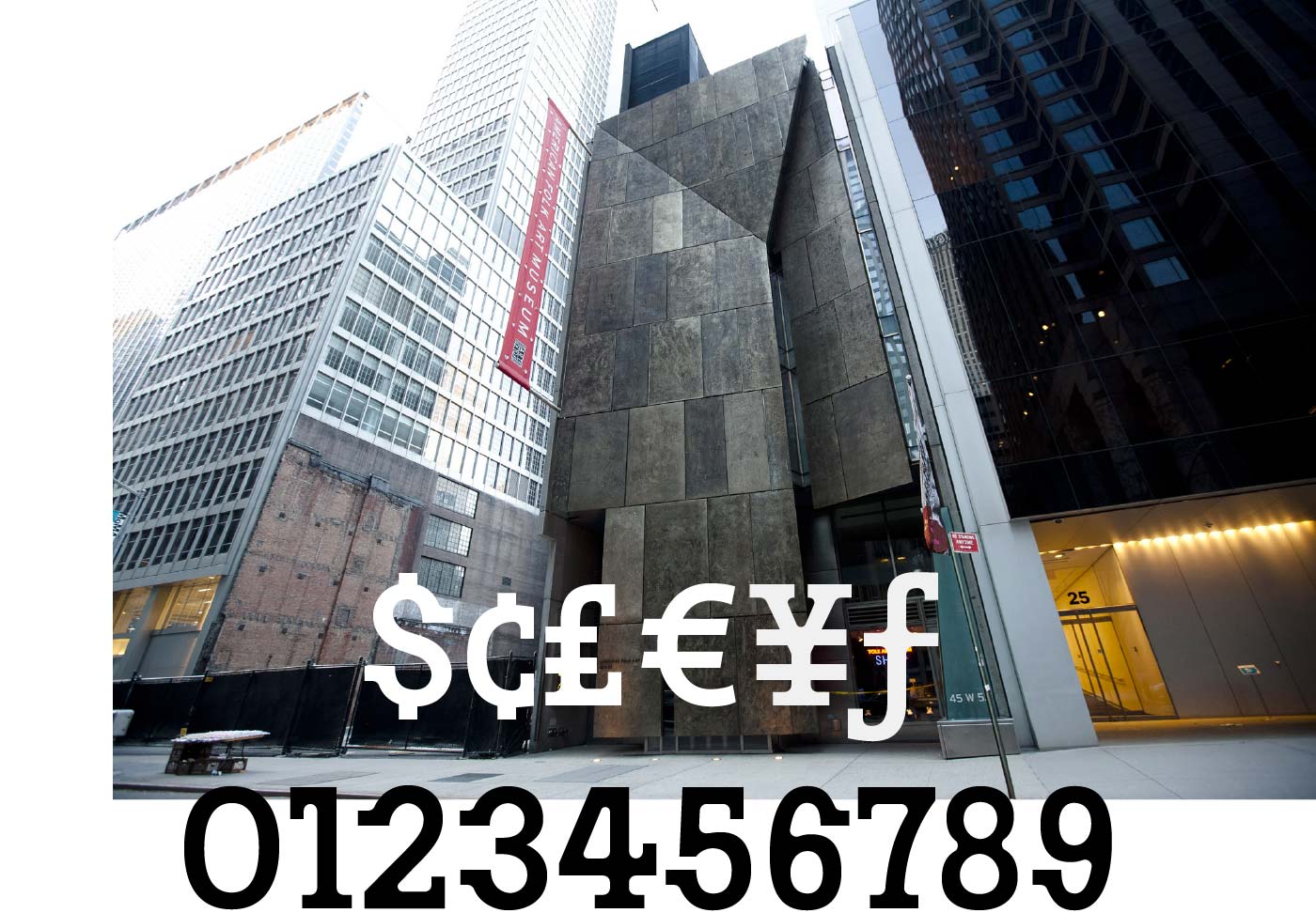
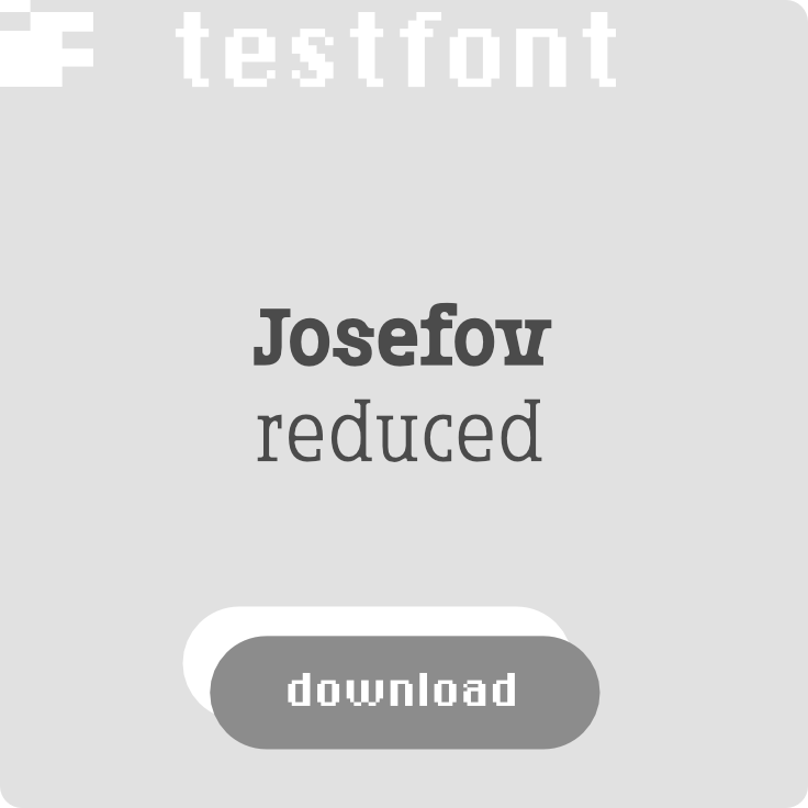
slab serif roman rounded striking JOSEFOV is — as the name implies — directly derived from the sans serif text font ”Josef“.
Here also originates the touch of the unusual relation of large x-height to the very short ascenders, even for modern serif fonts. The basic thought was to create a font with heavy rounded serifs in the style of ”Clarendon“ but which hardly reminds one of that particular font. In addition, the form principle of rounded serifs is applied whenever possible — for example at the points where the individual strokes of the characters join one another.
JOSEFOV seems very technical, very constructed (and truly is). In order to soften up the rigid impression, the serifs are applied at some points contrary to the tradition handed down, as with the upper case A C G K M V W and the lower case a b d h i j k l s t. Historically there is no example of the laterally oriented serifs of capital and small s (S) and C G. On the other hand, the double-sided serifs on the stems of b d h k l appear at the beginning of modern times in the very first serif types from Sweynheim and Pannartz and others. The double-sided serifs of A M V W were also customary in the first decades of printing.
buy now
ingoFont
Josefovprice (3 fonts): 48,— Euro
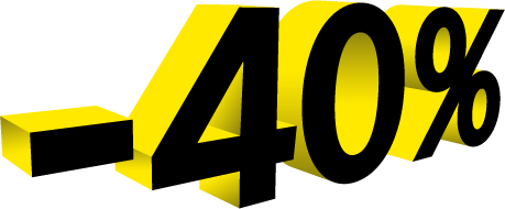 (
(80,— €)
license: EULA

If you need more than one license, just ask — we offer quantity discounts.test before
features: none
character set: A—Z resp. a—z only
price: free…more
Choose font variant…
…and enter your own text here:
size:
![]()
